
Graphic Design

.png)
Overview
ROLE: UI/UX Designer
CLIENT: The HistoryMakers, Chicago
TIMELINE: 12 weeks, 2021
TEAM: 2 Developers, 1 Researcher, 1 UI Designer
TOOLS: Illustrator, Photoshop, Figma
Client
The HistoryMakers is a non profit organisation that contains an archive of 148199 Stories from 2691 African- Americans collected in the form of video interviews. It was founded to address the lack of documentation and preservation of the African American historical record.
Challenge
The HistoryMakers existing digital archive lack the opportunity to communicate with young community and engage them in the historical process. Our team was tasked to create a visual, interactive and playful web browser experience that will attract the interest of new audiences and encourage them to learn about African American history from The HistoryMakers database.

Design Process
Project Definition
Research
Analyze
Design
Prototype
Test
Polish
Project Definition
Business Goals
Demographic
People of age 20-29 years of all cultures and professions.
.png)
.png)
.png)
Draw Young People
Visually Attractive
Cross-Platform
Research
Research Goals
-
Understand users' general interests in history
-
Understand the use cases of The HistoryMakers archive
-
Understand users' frustrations with the existing archive
User Interview
To learn more about the current young people’s interest in history and African American culture, I worked with the UX researcher to conduct interviews with 30 students and professionals of different races between the ages of 20-29. We used the second half of the interview to conduct usability test of the HistoryMakers existing archive to understand users' frustrations with archive's information architecture and visual interface.
Research Methods
In-depth interview
UX review
UX Review
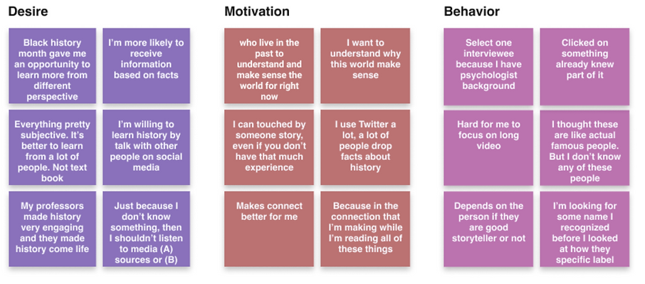
User Needs
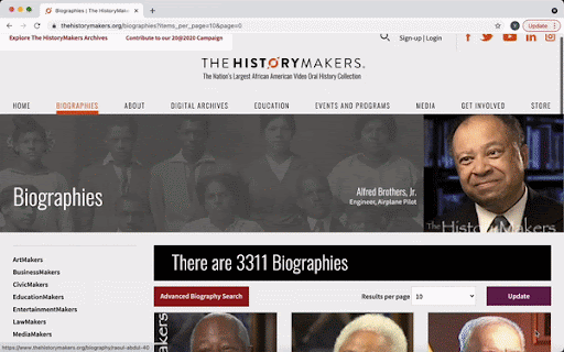
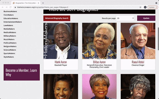
3K+ People Sorted By Last Name
More than 3000 history-makers are sorted alphabetically by their last names. Thus, many users ended up clicking the first couple of people (whose last names usually start with A) and never had the patience to click through other pages to find what they actually like.
Limited Info Displayed
Users had to click back and forth to see the biography (which is often incredibly long) in order to make sure that person was interesting enough.
Define
Research Analysis
Overwhelming Size of Data
Hard to Find Relatable Content
Visually Dull and Disengaging
User Pain Points
User Needs
Provide an easy starting point
Find people aligned to user's interests
Visually appealing and appropriate
User Persona
.png)
.png)
How May We?
UX Strategy
Ideate
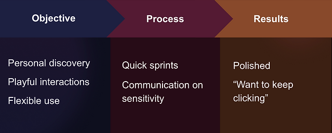
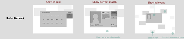
We started the brainstorming process with each of the team members pitching 5 ideas that could acieve our design objectives. We organised our 25 ideas in 3 themes that seemed abstract enough to not offend the sentiments of the African American community. Then I created storyboards and low-fidelity prototypes to pitch the ideas to our clients.
 |
|---|
 |
 |
 |
 |
 |
 |
 |
 |
 |
 |
|---|
 |
 |
 |
 |
 |
 |
 |
2
3D timeline (animated storyboard)
1
Constellation (interactive website)
3
3D library (unity mockups)
 |
|---|
 |
 |
 |
 |
 |
 |
 |
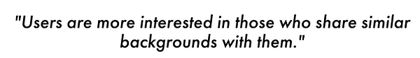
Experience Personalisation
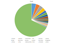
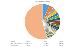
From the user research we knew the users' are more interested in an experience that was relatable to them. We worked with the HistoryMakers to derive data that would allow us to create a personalised and relatable experience for the users.
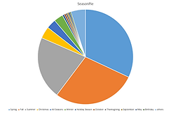
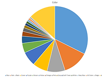
Data Analysis for Relatable Content:
Some common data we found from all the 3000 HistoryMakers' interviews were -
-
Favourite Food
-
Favourite Color
-
Favourite Season
-
Occupation
-
Birth Year
Design
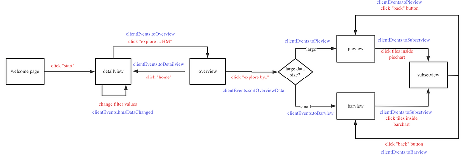
User Flow
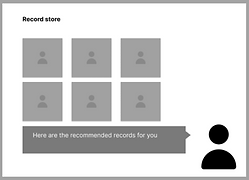
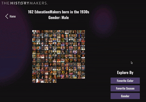
Explore 2 Sections
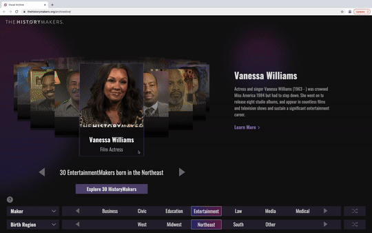
1. Detailed View Section
Playful image carousel with slider filters for easy exploration.
.png)
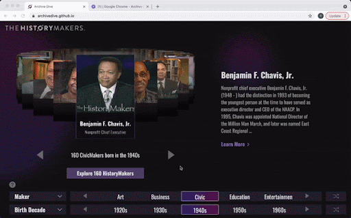
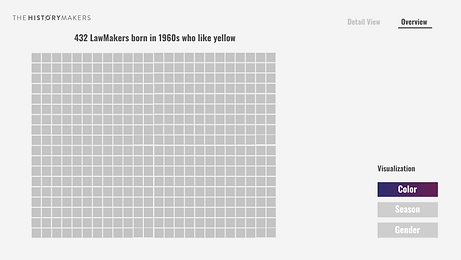
2. Overview Section
Engaging data visualisation to explore content based on more personalised filter like favourites.
Wireframes

Overview Section
Iterations
I planned and led weekly design sprints to test and iterate the designs and functionality. We conducted usability test with 10 users at the end of every week and used techniques such as direct observation, surveys and interviews to get their feedback.
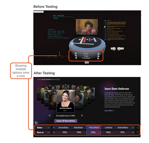
#1 Better Filter Design
BEFORE: Users can only see one option at a time so they have to click through all the options to find what they want.
AFTER: Made the filters flat so that users can see multiple options at a time.
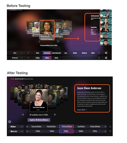
#2 Clearer Information
BEFORE: Most users tried to click the biggest tile in the center unconsciously to see the information which was already displayed on the right side.
AFTER: Added the fade-in and fade-out effect to the biography information so that the animation can catch the user's attention better.
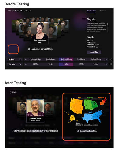
#3 Additional Help Button
BEFORE: Some testers didn't know how the states were categorized into these regions.
AFTER: Added a help icon that explains the region category and order convention.
Final Design
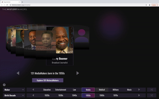
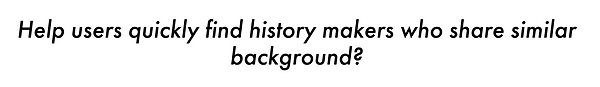
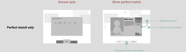
Narrow Down Your Search
First, select the filters based on your interests! It helps you to narrow down from the 3000 history-makers. Feel free to try out different answers or even the filters themselves!

Choose One You Like
The carousel on the left contains all history-makers that match your answers. Simply browse through it using your mouse. And the short bio on the right side will help you make the decision.
Want To Learn More?
Just found someone you are interested in and want to learn more about? You can click LEARN MORE and go to the biography page on the
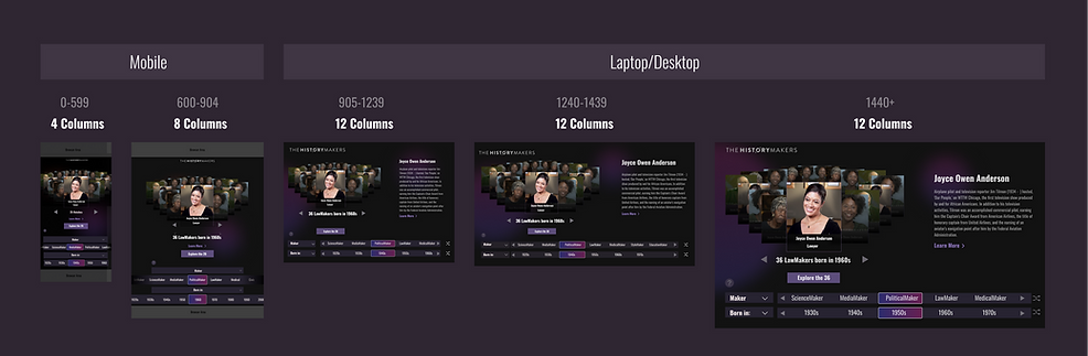
Responsive UI
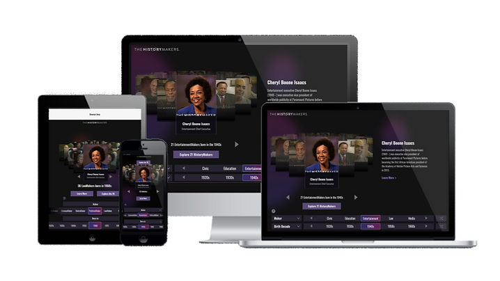
UI Kit

Impact
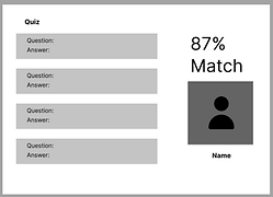
With our newly designed website, there is no bias towards the people on the first page like before. All history-makers now have an equal chance to be discovered by users. 87% of users are able to find the history-makers they like. And 75% of users expressed interest to visit the website again.
Our client is so satisfied with our final design that they decided to publish our website on the HistoryMakers official website! Let's hear our client's feedback on us!
Team Branding Design
Team Website: https://project-archives.etc.cmu.edu/2021/spring/archive-dive/
Logo
Team Branding Design
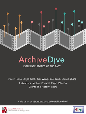
Poster